Here's a quick update on some more MODX 2.3 design work and a follow on from my previous post. An upcoming work commitment and some time off means I'm handing these in a little earlier than planned. Despite some inconsistencies and a general tidy up, I'm pretty happy with them. Another two or three days design work would probably take them across the finish line but it's not something I'm likely to be able to tackle within the next 2 months.
The Apps screen is my attempt at a redesign of the Package Manager. Having looked at the current layout, I've spotted some opportunities to consolidate some of the interface elements displayed and turn this into more of a traditional grid layout.
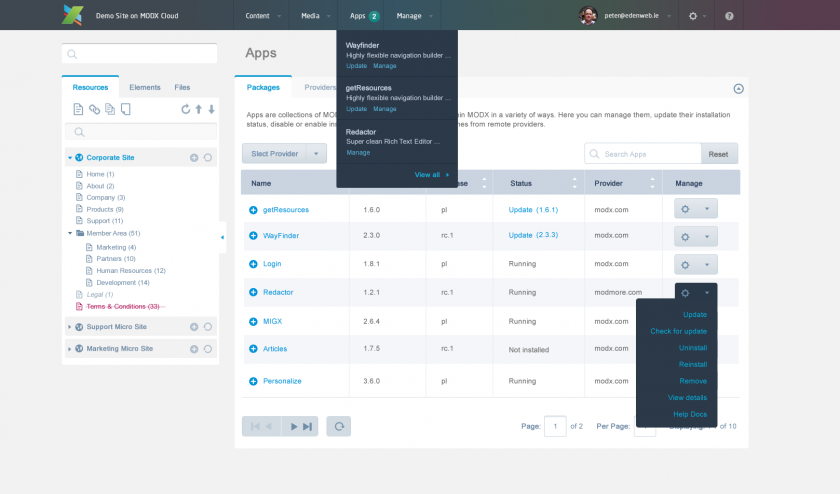
The View Details button has been replaced by a plus symbol to the left of the App name (which is also a link). Clicking this toggles visibility of the App info panel.
Unsinstall, Resinstall, Check for Updates, Remove etc have all been consolidated into a Manage column. The little cog button in the final column is a drop down menu where many App actions are brought together.
I've a new Status column which supersedes the Installed column. The Status column displays the current state of an App and those possible states are Running, Not Installed, and Update (Version Number).
There's an opportunity here (IMHO) to merge the Version and Release columns into a single column. I don't how useful it is to display and filter these separately when a single column would suffice.
Finally (and this may be a little overkill), the Apps link on the top navigation bar now has a drop down menu containing some update info (see below).
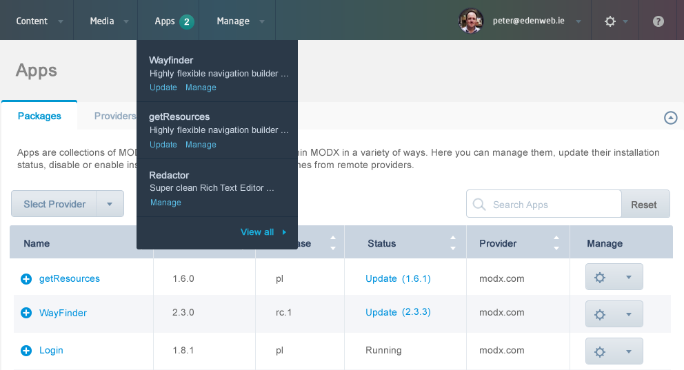
You can see that 2 of my Apps (Wayfinder and getResources) have updates and the little 2 in the nav bar indictates this. I borrowed this idea from the MODX Cloud dashboard and it's pretty cool.
In the case where you have 10 or 20 Apps installed, you don't want a huge drop down menu listing all of them so perhaps the drop down menu only displays your 'favourited' apps and then a View All link.
One aspect of the Manage Users screen I've always wanted was photo integration of Users. Here's how that works with a small 38 pixel photo integrated into the grid.
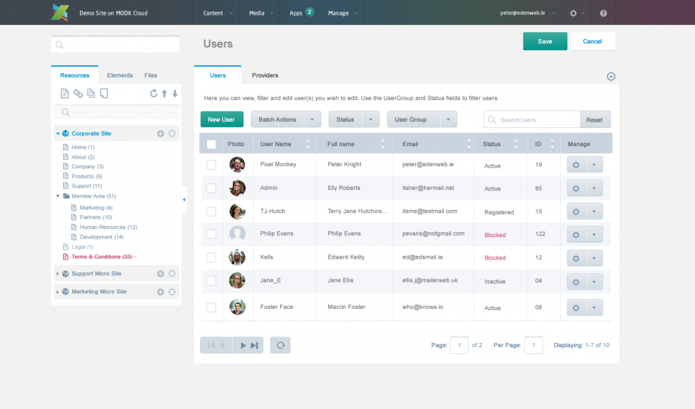
Where no photo exists, a simple silhouette image exists (see User, Philip Evans). To achieve the space required for a photo, I've merged the existing Active and Blocked columns. Those two cols now exist under a single Status column. Similar to the Status of Apps (mentioned above), user status can be Active, Registered (but not active), Blocked and Inactive. Perhaps Inactive can be dropped or a user can be considered Inactive is they've no activity within a X month period as determined by a Manager.
I've a new Manage drop-down field in the final column of each users row which again stores a number of User management actions. Have yet to decide what those could be!
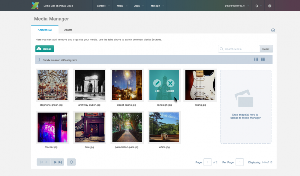
While I was having a go at redesigning some screens, I thought I'd apply the current design to JPs new Media Manager screen. Apart from introducing some of my own photographs, I haven't done too much rework on this one.
Finally, based on comments from MODX users in relation to my previous post, I've tweaked some elements on the create/edit screen.
Changes include:
- slightly different color scheme (less bright)
- form fields more closely match current 2.2.X heights
- more compact Resource Tree

Ahmed khan 12 years ago
Looks great. I'm sure there are things that can be improved but I'd be happy to just see this implemented.
I am just new to this blog, need to learn basics. Thanks for sharing

Jörg Lippmann 12 years ago
This looks much better than everything I've seen of 2.3 so far. Much better use of color and contrast.

Mangesh 12 years ago
Looks amazing ... Cant wait to try it ....

gladmin 12 years ago
Sure, Lodewijk. Go for it :)

Lodewijk 12 years ago
Hi, beautifull designs Peter, great job! I still use modx evolution for smaller sites. Do you mind if I use your designs to create a new template for evo? I'll share it with the community when it's done offcourse :)

Mary 12 years ago
Looks very nice and tidy. I especially like the Apps screen and users management screen. Would be interesting to see if this could easily be ported in MODX as an alternate manager screen.
Mary

Todd 12 years ago
Absolutely beautiful. I want it right now. Well done.
gladmin 12 years ago
Hi Steve.
Good question.
>>>How far did you take in to considerations ExtJS limitations and implementation practicalities in these designs?
Right now I'm only interested in putting something forward that could be realised relatively quickly. A more exciting departure from the current design would likely require rewiring of the back-end and would contribute to significant delays with the launch of 2.3.
I'm aware there *are* ExtJS considerations that limit the current MODX Manager. I'm not overly familiar with what exactly those limitation are.
So my approach has been to provide a reskin of the existing Manager and a general clean up. There are places I've been a bit more adventurous with the design and layout but overall, I'd say 75% of this design could be sucessfully translated into the MODX 2.3 Manager with just CSS. Perhaps some of the Core team or someone more familiar with ExtJs would be in a better position to answer that.
And by the way, these are just my own designs. There's no discussion (that I know of) about these actually being adopted by the team but I would love to see *a* version of 2.3 running these after they've been tweaked a bit more.
>>What would it cost me to actually get someone to implement this?
Maybe ask on the Forums? But you may want to hold off for the moment. I think JP is doing some work on custom manager theses. Perhaps he can confirm.

Steve 12 years ago
Looks great. I'm sure there are things that can be improved but I'd be happy to just see this implemented.
How far did you take in to considerations ExtJS limitations and implementation practicalities in these designs?
What would it cost me to actually get someone to implement this? I'm getting bored of seeing good work not being able to move forward. I'd consider funding it if it actually happened.
Cheers,
Steve
gladmin 12 years ago
Wow, thanks Joakim. Agree completely about the manage drop downs and the checkboxes. I love big form fields but these are too large really. The back/next and refresh buttons under each grid need refining as they're out of scale with some other UI elements. Thanks for the feedback though. Glad you like.

Joakim Nyman 12 years ago
Incredible work, truly. Looking at these and comparing to 2.2.x feels very refreshing and in some way relaxing. I especially love the Apps screen, it's clean, simple and to the point. As you say however, the version and release columns could well be merged, I personally have never ever had a reason to sort by release alone, besides, it's part of the version anyway. Release on it's own tells you nothing really. I also like the cog dropdown for actions very much. Makes the grid less cluttered and less intimidating to look at.
As for the User management, I like the Status column and the added photo. Looks very nice and tells you what status the account is at, without having to process the columns yourself (is it active? yes/no, is it blocked? yes/no) to find the true status. The manage dropdown could hold the right-click actions (update, duplicate, remove).
Something that perhaps could be improved upon is the manage dropdown buttons, they feel a little big. Same goes for the checkboxes. Other than that I'd be incredibly happy if the manager looked like this!
gladmin 12 years ago
Thanks JP. I love cleaning up complex information and simplifying things but I was keen to keep it MODX-ish. As clean as I'd like to think they are, even these designs might be a little too colorful and generous with layout/spacing for some. I'd like to create a more pared back theme and try limiting the design down to just two colors. Someday. :)

JP DeVries 12 years ago
These look fantastic. We spent so much time abstracting, and flattening the previous 2.2 theme that it has left the current default theme rather stale. This is refreshing, but still keeps the branding.