While the goal here is to contribute something worthwhile to the community that can be further improved upon (MODX is Open Source), it’s also a slightly selfish endeavour. Using MODX every day means I have a very real interest in seeing the interface become a little less cluttered, a little more user-friendly and perhaps a little more about the user and their content goals than the technology upon which the CMS is built.
Of course, I’d love to wipe the slate clean and start from zero; to pretend there’s nothing already in place, to ignore the current branding and pretend I haven’t seen the latest 2.3 design work. But while it’s tempting to dive in and redesign the entire CMS, I see this as more of an exercise in improving the current design rather than a complete reboot. MODX 2.3 is being actively developed right now so it’s more useful to introduce some design changes that could be implemented soon rather than creating something that would require major redevelopment on the backend.
But I’m hoping that a complete redesign will eventually happen and I’m aware that the MODX community is full of talented designers. Just as the current 2.3 design work formed the basis of my own tinkering, maybe we can get a discussion going among the network of designers and all help improve a product we already love. To that end, my PNGs / source artwork will be made available shortly if you'd like to roll up your sleeves and get stuck in.
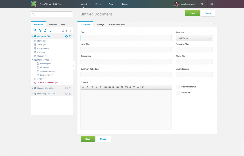
So to recap, this is what I believe my design is bringing to the table.
I have more in progress so I hope you like what I've done. Or even better, if you hate it, get involved and improve it. MODX is OpenSource and that doesn't just mean the back-end development is user contributed.
Notes:

Claudia 12 years ago
Hello,
thanks modx for this great new release!!
Where can I find in the backend the info about the actually installed version? In the previous version it was displayed after login in the tab ...
thx

Jim 12 years ago
This is a really nice white theme. I think a really important development with modx 2.3 would be skin support (much like gimp, firefox, thunderbird, etc, has). It would be under settings --> manager themes (or manager skins). Then essentially, different color schemes could be created submitted to a central theme (or skin) store, where themes/skins could be selected and implemented on the fly.

Peter Knight 12 years ago
Sounds interesting. Does your custom login page get wiped everytime you do an upgrade or are you running login away from the usual /manager page?
Peter Knight 12 years ago
Hi Jeff
Most of the color reference are taken from the MODX logo. Maybe a little of that brightness can be toned down for the actual UI elements. I have a slightly modified design in the works with more muted coloring for the actual interface.
Peter Knight 12 years ago
Hi Raymond. Great idea - I'd love to collaborate on some designs. At the moment I'm swamped with work and will probably only manage to create a single set of designs (my own) this time around. But lets hook up by email and see what we can churn out?
Peter Knight 12 years ago
Hey Vitaly. Great point about multi-lingual versions. I designed a site recently for a Russian client and the length of Russian words was a real eye opener :)

Pavel Lautsevich 12 years ago
Really interesting look at the Manager UI. Creates the impression of lightness and simplicity. Of course there is a small mistakes, however, the work must certainly be continued!

Raymond Uphoff 12 years ago
This is an awesome contribution. I immediately thought hmmm fresh and clean!
We, that is Hugo Peek from Qaraqter and I Raymond Uphoff aka myradon, made an appointment to team up for improving the User Interface for MODx Revo. So you are actually doing the same thing. So I'm thinking out loud; we have to team up. Maybe we can tunnel this through the MODx UX/UI (whatever) section of the forum. Maybe some online meetups/ chats/ hangouts/ pitches/ ideas whatever. So what do you think?! Off course MODx Team has to be involved too.

JP DeVries 12 years ago
This is fantastic work. Default or not, I'd like to see this theme available for people to use. I do think the sidebar should still stick left, and the main column should take up remaining (or up to a certain amount of space) rather than being centered in wide browsers.

Christian Bartels 12 years ago
I was highly inspired on this and thought I'd make a mock-up too, that takes a few ideas of your design and also alters the manager's "behaviour" a bit. Not to be meant as criticism to your work or the current work for 2.3, just a few ideas to be hopefully considered for a future MODX release. Take a look if you like and please let me know what you think: https://www.bequadrat.de/blog/2014/01/modx-manager-re-thought.html

Jeff Jones 12 years ago
I think the layout is a plus. However I'm not a big fan of "fluorescent" colors in an application interface. It has been my experience that clients sometimes think it's not as professional or in some way designed for kids. Lowering the brightness of those "hot" or vivid colors slightly would be my preference.

Ryan Thrash 12 years ago
Well you helped push it over the edge for us, Peter, and accelerated an idea we've been toying around with for months: http://modx.com/blog/2014/01/29/an-epic-announcement-died/ Being that you're well underway, I hope you'll participate!

Mark Hamstra 12 years ago
@Vitaly: The search bar in 2.3 is referred to as "uberbar" and searches through pretty much anything - resources, elements, users, actions (clear cache etc). In the current 2.3 iteration it's in the header top bar. What I like though about this mockup with the search bar on top of the tree is that it lines up the resource update panel tabs with the tree tabs.

DESIGNfromWITHIN 12 years ago
Really nice! Totally love the style and new layout of 2.3!
Mark Hamstra 12 years ago
Made some progress, though still a far, far way off :P
Screeny: http://note.io/1d6GvZO
Source: https://github.com/Mark-H/revolution/tree/ui-edenweb
If anyone wants to continue working on this, please do. I'm not an expert at the shiny box shadow-y stuff (or any CSS3 things) so this could definitely use someone else's skill set
Mark Hamstra 12 years ago
Hey Peter - could you share a zip with the used assets (primarily the top bar and the slightly different MODX logo? I've started putting this into a git branch (progress is slow, so no rush) but having those files would help tremendously. :)

Christian Seel 12 years ago
That looks really nice! I love the styling of the top bar and the contrast between the background and form. Looking forward to see more!
gladmin 12 years ago
Thanks everyone for your support and feedback. I've had a few private comments about the practicalities of some elements of the layout so I'm hope to improve upon those elements in the next stage. :)

Joakim Nyman 12 years ago
I have to agree with Mark. This to me makes the manager clearer than ever, while keeping all improvements in 2.3 so far. It's very clean, yet clear. I think end-users would find something like this much easier to take in and would feel less scary at first sight.
Ryan Thrash 12 years ago
Gorgeous and love it! Keep cranking that kind of stuff out, and find someone with Sass skills and make it a reality!

Revital Agency 12 years ago
Wow great design! Also looking forward to the next release of MODX. We customize the login page but not much else with the current framework.
Peter Knight 12 years ago
Thanks Mark. I really like the current 2.3 work too. I think the MODX community is full of great designers so I am hoping this work will soon be leap-frogged by someone elses design.
Mark Hamstra 12 years ago
While I'm really happy with the progress on 2.3 so far, this mockup brings (in my non-designer eyes) a LOT more clarity, it's easier on the eyes and there's no confusing borders everywhere. Love it!